

Table of Contents
How to Make an Existing Website Mobile Responsive
You can learn how to make an existing website mobile responsive starting with understanding that Google uses the mobile version of your site in its indexing and rankings when using the mobile-first index. responsive web design is the recommended setup as it uses the same HTML for both the desktop and mobile versions via a single URL. To follow along, you’ll go over the process step-by-step: auditing the site on a mobile phone, implementing the various approaches to mobile-ready sites, and checking them out once everything has been added to make sure they work properly on all devices.
To start, assess how you’re doing now in terms of your website being viewed via smartphones. This will help identify any shifting layouts, long loading times, or blocked files, which can really impact your users’ experiences as well as their ability to find the site through search engines.
Key Takeaways
- Before making your site responsive, check out all elements that can negatively impact traffic or user experience.
- This will be the first thing you need to do if your current web-site needs to become responsive for mobile devices – add a suitable viewport meta-tag into the HTML head part of your page.
- After adding a viewport metatag to your site, other media becomes the new breakpoint for mobile sites.
- Once your layout runs on fluid grids, the next key step in how to make an existing website mobile responsive is adding media query breakpoints.
- As soon as you have your breakpoints nailed down, start with navigation.
Before You Begin: Audit Your Current Mobile Experience
Before making your site responsive, check out all elements that can negatively impact traffic or user experience. Google’s mobile-first indexing means every page must load properly on phones, so we recommend checking four key areas first. So let’s have a look at four parts here, then we’ll get started.
- Use the Mobile-Friendly Test and Mobile Usability report in Search Console to identify pages that fail and the exact reasons why, such as blocked CSS or JavaScript resources.
- Confirm that all CSS, JavaScript, and image files are accessible to Googlebot; blocked resources are the top cause of failed mobile assessments.
- Compare mobile and desktop versions for content parity—ensure primary content, structured data, metadata, and headings match, since mismatches can reduce visibility under mobile-first indexing.
- Measure tap targets: primary buttons and links should be at least 7mm wide with about 5mm of spacing between secondary targets to meet usability standards.
- Verify that critical content isn’t hidden behind lazy-loading or user interactions, because crawlers may never see it.
The simplest fix once your website has been audited: make sure the viewport meta tag in your HTML file allows for different sized screens.
Step 1: Set the Viewport Meta Tag
This will be the first thing you need to do if your current web-site needs to become responsive for mobile devices – add a suitable viewport meta-tag into the HTML head part of your page. This single line instructs the browser how to properly scale and draw your web-site in a small window like the screen of a phone or tablet.
<meta name="viewport" content="width=device-width, initial-scale=1.0, maximum-scale=2.0, user-scalable=yes">
Add this meta tag as the first element inside the head section of every page. It could be that your site isn’t properly rendered when accessed through some mobile web browser if you don’t include this tag. Test the page in different devices to see if the tag works for all users.
You should avoid disabling user zooming by specifying ‘user-scalable=no’ or setting ‘maximum-scale’ below 2.0, because that blocks critical accessibility features required by WCAG 2.1 success criteria 1.4.4 and 1.4.10. When the viewport settings have been applied, your images and layout can scale properly across devices.
Step 2: Make Images and Video Flexible
After adding a viewport metatag to your site, other media becomes the new breakpoint for mobile sites. To make media look nice on all devices, we suggest using viewport-relative units like vw, vh, vmin and vmax to size images and video sizes in such a way that the media resizes according to the device’s screen instead of the other way around.
For richer control, the HTML picture element and the srcset attribute let the browser select the best image based on the device’s screen density and size. According to the W3C’s device adaptation roadmap, these responsive techniques replace outdated static adaptation strategies, which the industry now treats as obsolete. Flexible media still needs a flexible container to sit in, so we’ll cover fluid grids next.
Step 3: Replace Fixed Layouts with Fluid Grids
Once we’re able to scale images and other media properly, however, many container elements still get locked into a fixed width, in pixels. And as such, we end up with a lot of horizontal scrolling when looking at websites on our smartphones. The problem is that most layouts are still built for a single fixed screen size, ignoring the fact that most browsers range anywhere between 320px wide and much higher on larger desktops. Fluid layout fixes the problem by making use of viewport-relative units (vw, vh, vmin and vmax), percentages for widths and allowing the layout to adjust or flow rather than overflow.
For a fixed layout, walk through each container replacing its pixel width with something more flexible, e.g., percentages or ems. Make sure grid tracks will wrap or resize at narrow widths. At this stage you should also test this at 400% zoom on a 1280×1024 viewport, or equivalently 960px wide at 300%, just make sure there’s no multi-directional scrolling. Be careful if doing visual ordering of grid items as their position may affect how users navigate via tabbing, possibly breaking it.
Step 4: Add Media Query Breakpoints
Once your layout runs on fluid grids, the next key step in how to make an existing website mobile responsive is adding media query breakpoints. A media query is a CSS rule that applies styles only when specific device conditions—such as screen width, orientation, or color capability—are met, as defined by the World Wide Web Consortium’s Media Queries Level 3 Recommendation.
Add this bit to your style sheet for screen widths smaller than 768px. Start off with something simple, like this.
@media (max-width: 768px) {
  .container {
    padding: 1rem;
  }
  nav {
    flex-direction: column;
  }
}
We recommend adding your breakpoints gradually, checking the layout on different viewport sizes instead of aiming for particular screen sizes. The fluid grid developed in the preceding step can be enhanced using those breakpoints at certain viewport sizes.
Step 5: Simplify Mobile Navigation and Menus
As soon as you have your breakpoints nailed down, start with navigation. Navigation collapses desktop menus that were crammed on to narrow screens for smartphones, making users angry and reducing their value when indexed under mobile-first indexation. Collapse any sub-menus which go deep into the menu hierarchy to only allow top-level items that can be quickly scanned. And finally avoid hidden navigation elements, because crawlers may never trigger them.
Use CSS media queries to reskin or hide your desktop menu when screen width becomes small. Perhaps this is as simple as using a toggle for hamburgers or a single-level list with viewport relative sizes. The result should have the same navigation elements that exist in the desktop view–this way our crawler sees all primary navigation links available even though they look different than what we see on a phone. Now that you’ve got a simplified menu, let’s make sure it’s easy for users to tap their way around it, so that their touch isn’t accidentally clicking something else.
- Collapse submenus to one level
- Limit top-level items to five or fewer
- Build the collapsed menu with
max-widthmedia queries
Step 6: Enlarge Touch Targets for Tapping
After that, make sure all clickable components within the navigation can be reached comfortably via fingertip. Too small buttons or overcrowded controls frustrate mobile users. Fingers aren’t as precise as mouse cursors, which means users could end up tapping on something other than what they intended and get frustrated.
Google recommends making primary tap targets at least 7 mm wide and tall to accommodate adult finger pads, which average about 10 mm in width. Secondary tap targets should maintain 5 mm of clear space between them to prevent accidental taps on adjacent elements. Increase padding around buttons and links, avoid placing interactive elements side by side without adequate separation, and test your changes on an actual phone or in your browser’s device-emulation mode to verify that every target feels comfortable to tap with a thumb. This ensures a smooth experience for users navigating your site on mobile devices.
Step 7: Test and Verify Your Mobile Site
Since tap targets have been properly scaled, now all that remains is to see how the entire site works on the small screen device. Run the Mobile-Friendly test from Google on some selected pages and ensure those pass the test. Next up, look at the Mobile Usability report from Google Search Console and make sure there aren’t any pages still being flagged as non-mobile friendly.
If your pages fail, the most common cause is blocked CSS or JS in your robots.txt file. Make sure that this page has access to all the needed resources so GoogleBot can properly render it. Once you unblock anything which is causing issues for you, you can either use Fetch as Google tool to ask Google to re-crawl it faster or update your site map to prompt them to check up those pages earlier.
The content needs to be the same as well. When on mobile, each page should look like its desktop equivalent, both when you load them, but also for the metadata and heading elements, so that we can crawl and index the whole thing properly.
Fixing Common Mobile Responsiveness Problems
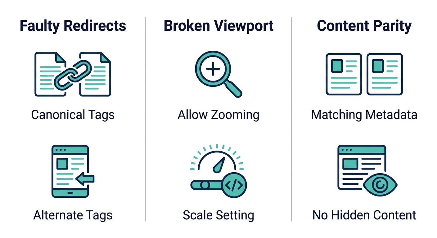
Problems that show up in the check report can generally be grouped into three main categories: bad redirect errors, viewport issues, and mismatched content for different devices. When you solve those problems, more pages will get indexed by Google and people will see them correctly when they browse from their smartphones.
Fix faulty redirects between desktop and mobile
If you send mobile traffic to irrelevant pages or show desktop content at mobile URLs, google might not be able to find the proper page. We often see this happen in cases where m-dot sites have misconfigured their mobile/desktop redirects. It’s critical each mobile/desktop redirect correctly sends mobile users to its own mobile/desktop destination page and vice versa. If a site uses m-dot URLs exclusively, treat each respective desktop and mobile url as the canonical and alternate link types. Set the desktop url as canonical and the mobile url as alternate via the rel="canonical" tag and rel="alternate" tag respectively.
Correct viewport settings to allow zooming
The page fails to meet accessibility requirements if it uses the property user-scalable=no in its meta viewport tag or sets maximum scale to any value lower than 2.0. Make sure that your site supports at least 200% zoom by modifying the tag contents. Example code would look similar to this: <meta name="viewport" content="width=device-width, initial-scale=1.0">.
Ensure content parity across devices
Mobile pages must have the same major parts of content, titles, meta descriptions, and structured data as their equivalent page on a normal-sized computer. If there is less information about the page for mobile devices then it might be dropped lower in results. Don’t leave main content hidden behind user interactions, load it in the initial payload so Google can index it fully.
Frequently Asked Questions
Why is Mobile Responsiveness Essential for Converting Catering Event Inquiries?
Mobile responsiveness ensures catering websites display correctly on phones and tablets. Google’s mobile-first indexing uses the mobile version for rankings, so a non-responsive site can lose visibility and potential event inquiries. Fast-loading, accessible mobile pages improve user experience and lead capture.
What are the best practices for mobile-friendly navigation and menus on catering websites?
Simplify navigation by collapsing submenus to one level and limiting top-level items to five or fewer. Use CSS media queries to switch to a hamburger menu or single-level list at smaller screens. Ensure all navigation links remain crawlable and visible to search engines.
How do I test if my catering business website is truly mobile-friendly for potential clients?
Use Google’s Mobile-Friendly Test and the Mobile Usability report in Search Console to identify issues. Check that CSS, JavaScript, and images are accessible to Googlebot, tap targets meet size requirements, and content parity exists between mobile and desktop versions.
Does having a mobile-responsive site significantly impact my search engine rankings for catering services?
Yes. Google’s mobile-first indexing uses the mobile version for ranking, so a responsive site improves visibility. Non-responsive pages risk lower rankings and fewer inquiries from mobile users searching for catering services.
How can I Make my Existing Catering Website Mobile Responsive without a Complete Redesign?
Start by adding a viewport meta tag to the HTML head. Replace fixed layouts with fluid grids using viewport-relative units, make images and videos flexible, and add media query breakpoints. Simplify navigation and enlarge tap targets for mobile users.
Keep Your Catering Website Mobile-Ready for the Long Run
Fixing common mobile responsiveness issues is only half the battle. How to make an existing website mobile responsive is just the first step — the real challenge is keeping it that way as devices, screen sizes, and Google’s indexing standards evolve. With Google’s mobile-first indexing now the default, a site’s mobile health directly shapes its search visibility over time.
The modern web demands fluid layouts that adapt automatically, not static fixes tailored to yesterday’s devices. As new screen resolutions and input methods emerge, responsive design built on CSS media queries and viewport-relative units remains the only durable solution. Regular maintenance ensures content parity between mobile and desktop versions and keeps images accessible with proper alt text.
Contact our experts from Wilson, NC if you wish to be always on top. Call us at (252) 725-7572 or send email to startthefun@cloudnbugs.com to arrange for a mobile audit appointment or learn more about creating a maintenance program specifically for your catering company.
Get Expert Help Staying Mobile-Ready
You now know how to make a site mobile-ready, from the initial audit through viewport setup, fluid grids, breakpoints, and touch targets. But as we covered above, keeping your site mobile-ready is ongoing work, new devices, evolving Google mobile-first indexing practices, and changing web standards mean periodic checkups matter. A live review of your SEO, user experience, and conversion performance can surface issues your own testing may have missed. CloudnBugs offers consultation sessions that end with a prioritized, actionable checklist tailored to your site. Our team works with WordPress, Shopify, and Wix platforms across North Carolina. Reach us at (252) 725-7572 or startthefun@cloudnbugs.com to discuss a maintenance plan or audit. Protecting your mobile visibility starts with one conversation.
Get Expert Help Staying Mobile-Ready
Resources
- Explore W3C Device Adaptation Roadmap for Mobile Web
- Get Mobile-First Indexing Best Practices from Google
- Learn Mobile-Friendly Guidelines for Google Search Success
- Check Viewport Zoom Accessibility with W3C ACT Rule
- Understand the Media Queries Level 3 Standard
- Master HTML 5.2 Document Metadata and Viewport Specs
- Get Answers to Google's Mobile-Friendly Update FAQ
- Discover CSS Grid Reflow Technique for WCAG Compliance
- Master Mobile-First Indexing Requirements for Google Ranking